Rebranding for the UK’s #2 Zoo
We have been working with Hoo Zoo since 2016. While working on a website refresh, we approached them proposing a strategic brand refresh to honour their heritage. This would be a subtle evolution rather than a complete rebrand to mature their visual identity.
The project demanded a relatively quick turnaround and a focused approach, aimed at equipping the team with a cohesive, versatile set of assets for their immediate and future marketing needs.
Retaining Heritage, Maturing the Look
The core objective was to modernise the Hoo Zoo brand without losing the family-friendly appeal they have built over the past 30+ years.
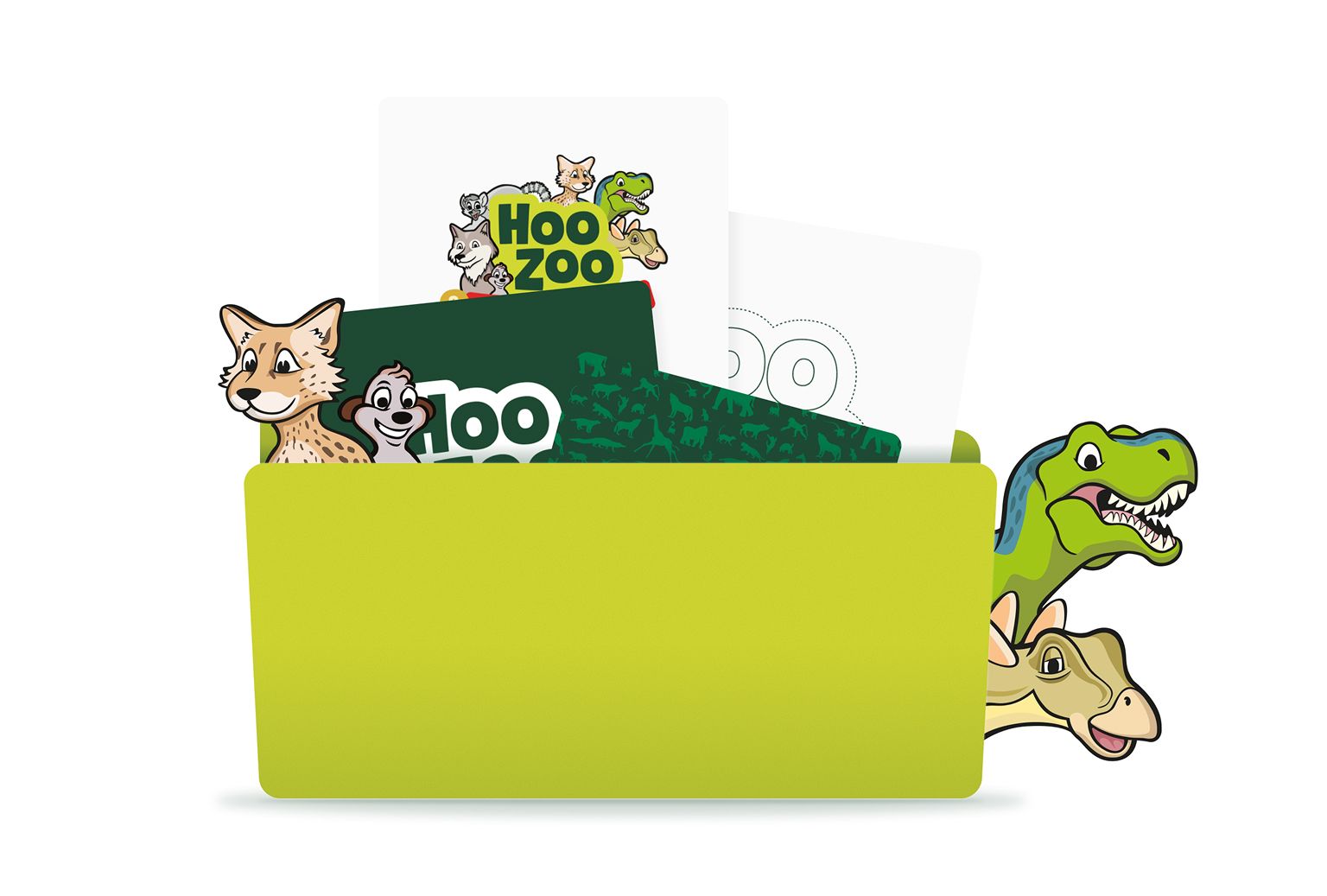
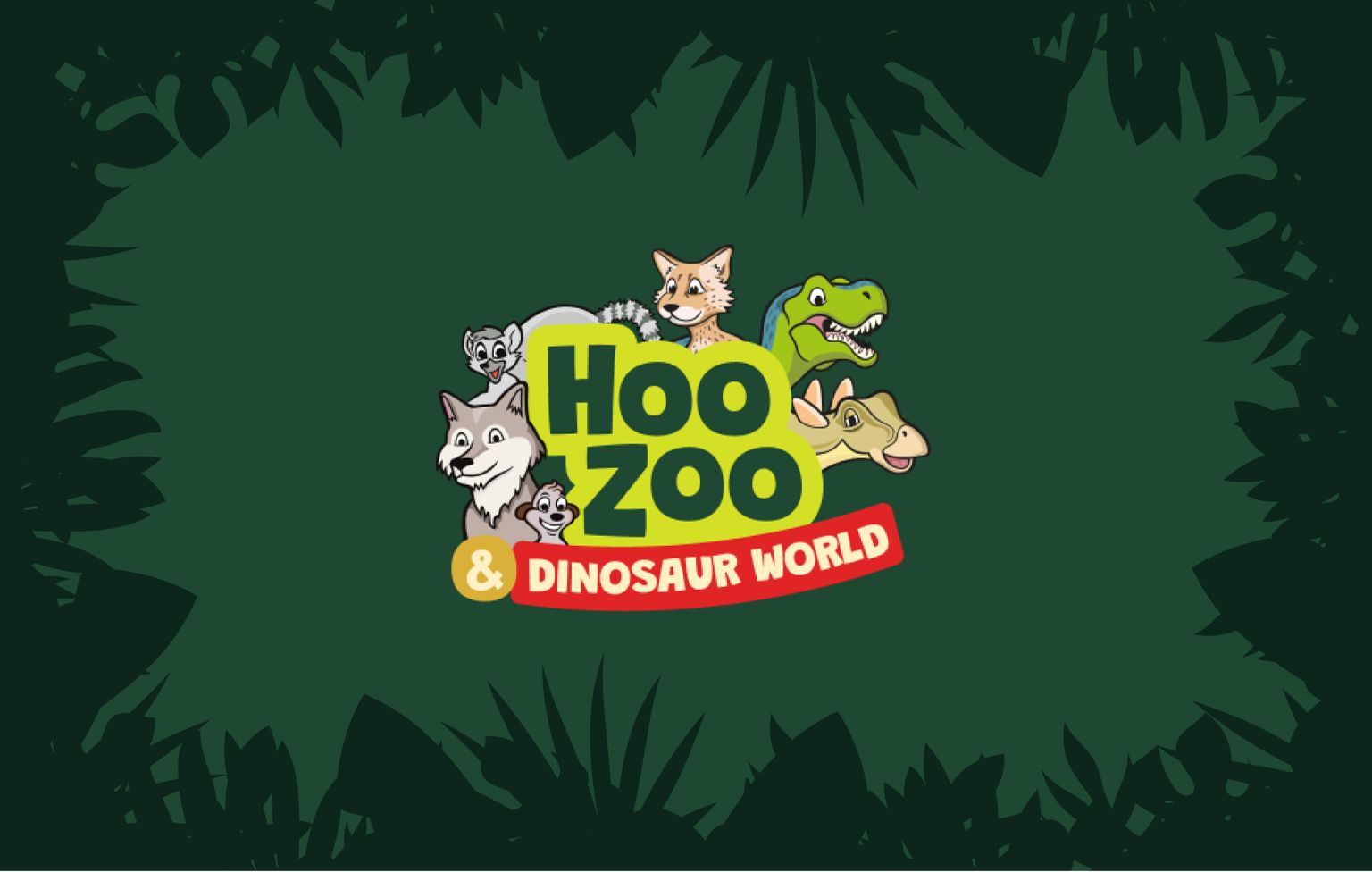
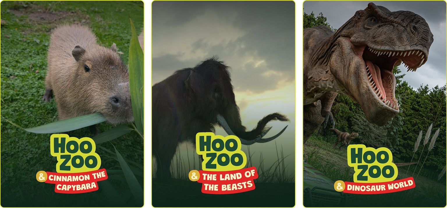
The biggest shift involved simplifying the primary logo mark, we started by removing entirely and modernising the “Hoo Zoo” text. Though the concept was to remove the animals from the logo entirely to create a cleaner, type-focused identity for day-to-day use, the animals are an iconic part of the logo, so we created another variation that included them.
They were strategically shifted to become part of the extended brand assets, allowing the zoo to retain and use their much-loved characters in promotional campaigns, educational materials, and signage as secondary visual elements, that their audience would recognise. We provided a set of two core logos: a simplified type-only version, and a secondary version that subtly incorporated the animal motifs.
This provided a more sophisticated and flexible foundation for the brand, ensuring it could adapt to future marketing materials and partnerships without feeling overly saturated with illustration.
Defining Cohesion and Clarity
To support the updated logo structure, we overhauled several key elements to ensure the overall brand system was cohesive and easy to implement across all media.
Refined Typography: The existing typefaces were modernised to improve legibility and provide a consistent visual hierarchy. We selected contemporary fonts that offered both a playful yet professional feel, complementing the family attraction’s core purpose while aligning with digital display standards.
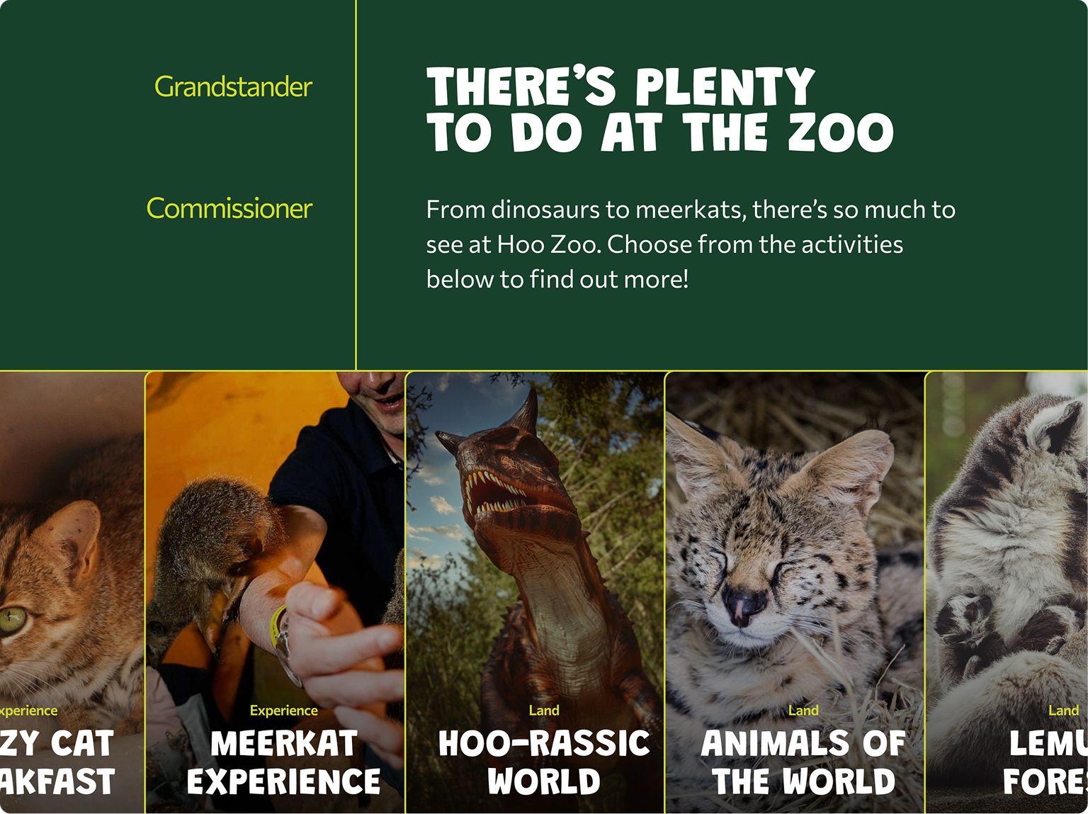
Optimised Sub-branding: A major focus was on streamlining the sub-branding, particularly the ‘Dinosaur World’ banner, which had been a new addition from the last few years. We developed a clear, scalable system for adding and managing sub-sections of the park, ensuring these elements felt like a unified extension of the main Hoo Zoo brand rather than an afterthought. This made applying the branding to various marketing campaigns, such as their email newsletters, much easier.
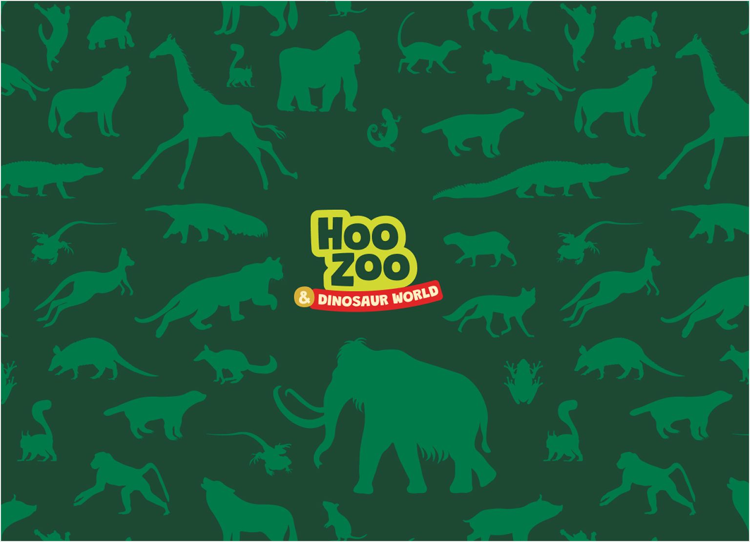
Cohesive Brand Palette: The colour palette was refined to be more cohesive and systematic. We consolidated the existing colours into a versatile primary and secondary palette. This careful selection ensured that all future design work, from internal documents to the new website, would communicate a single, professional identity, which helped resolve the previous issue with the visual inconsistency.
Deliverables and Impact
The brand refresh was delivered in a compact, usable format, designed for immediate implementation, ensuring the momentum of the website project was maintained.
Key Deliverables:
- Logo & Pack: A comprehensive pack featuring all necessary variations (simplified, secondary, black and white) in various file formats for print and digital use.
- Brand Guidelines: A concise document detailing the usage rules for the logo, typography, colour palette, and placement of extended assets.
The primary benefit of this quick strategic refresh was the immediate acceleration and improved quality of the website design process. With a more robust and well-rounded set of brand assets.This allowed our design team to create a modern, high-performing website with confidence, knowing the visuals were backed by a clear, consistent, and mature brand identity. The refresh provided the solid foundation necessary for Hoo Zoo to move forward with a unified,professional and familiar public face.